PixelsForged / Blog

Notes from
making things.

Observations on product strategy, interface design, and the small decisions that turn working software into a memorable product.

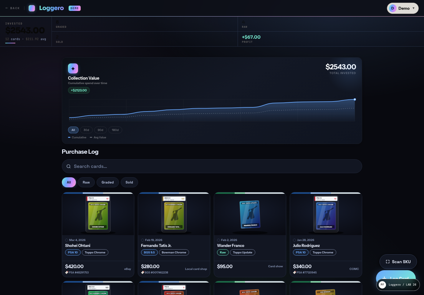
Loggero product dashboard

Useful software should still feel authored.

Read the note ↓
01

Latest notes

Design decisions, delivery lessons, and ideas we keep returning to.

01 / Product design

Useful software should still feel authored.

6 minute read

A product can be perfectly usable and still feel anonymous. The goal is not decoration. It is to make every decision feel related to the same point of view.

Good product design removes uncertainty, but removal alone does not create identity. Type, spacing, rhythm, motion, language, and hierarchy tell people what kind of product they are using before they consciously evaluate any feature.

The strongest systems give those choices a reason. A financial tool may feel composed and quiet because trust depends on calm. A fast utility might be denser and more direct because momentum matters more than ceremony. Character comes from the job.

That is the difference between styling a screen and authoring a product: every visible choice supports the behavior underneath it.
02 / Process

Small teams make
sharper products.

4 minute read

The advantage of a small team is not merely speed. It is the ability to keep the original problem intact as the work moves from conversation to interface to production.

Every handoff asks someone to reconstruct intent. A strategy deck becomes a wireframe, the wireframe becomes a visual design, and the design becomes an implementation. Each translation can flatten the idea.

When the same people stay close to the work, decisions compound instead. A technical constraint can sharpen the concept early. A visual pattern can become a reusable component immediately. Feedback reaches the person who can act on it.

Small does not mean underpowered. It means the distance between the question and the decision stays short.

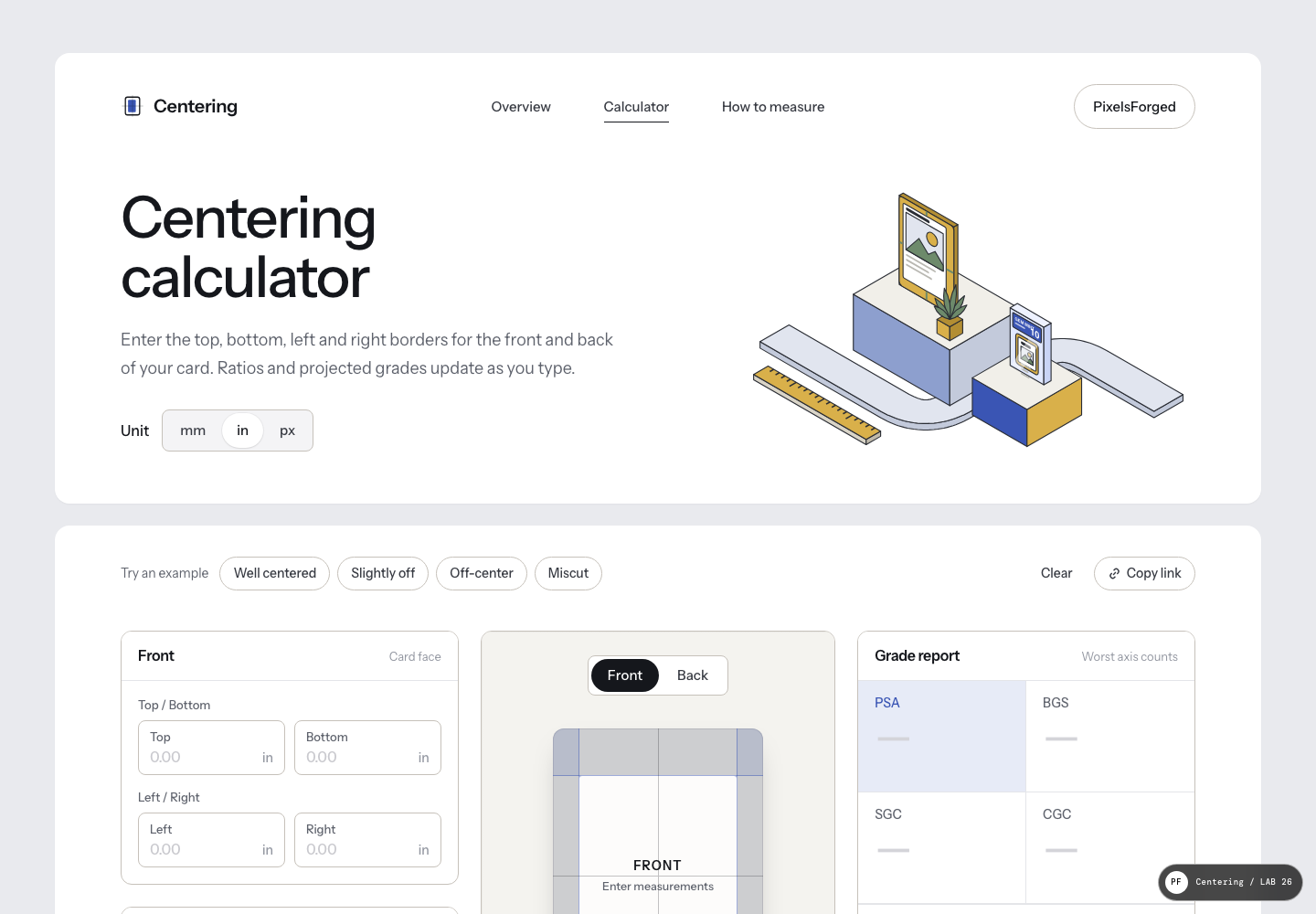
Centering calculator interface
03 / Development

Designing past
the mockup.

5 minute read

A pristine static screen is one state of a living system. The real design also includes slow networks, empty data, errors, small phones, keyboards, and the hundred ordinary moments between launch and success.

Building in the browser exposes questions that a mockup can hide. What happens when the title wraps? Which control gets focus next? Does the layout still make sense when the list is empty or unexpectedly long?

Those are not cleanup tasks. They are product decisions, and they deserve the same attention as the hero screen. Prototypes become more valuable when they include real content, real states, and real constraints early.

The finish line is not visual approval. It is a product that continues to feel considered while someone is actually using it.

Have a product worth making?

Bring us the
hard brief.

Start a project →